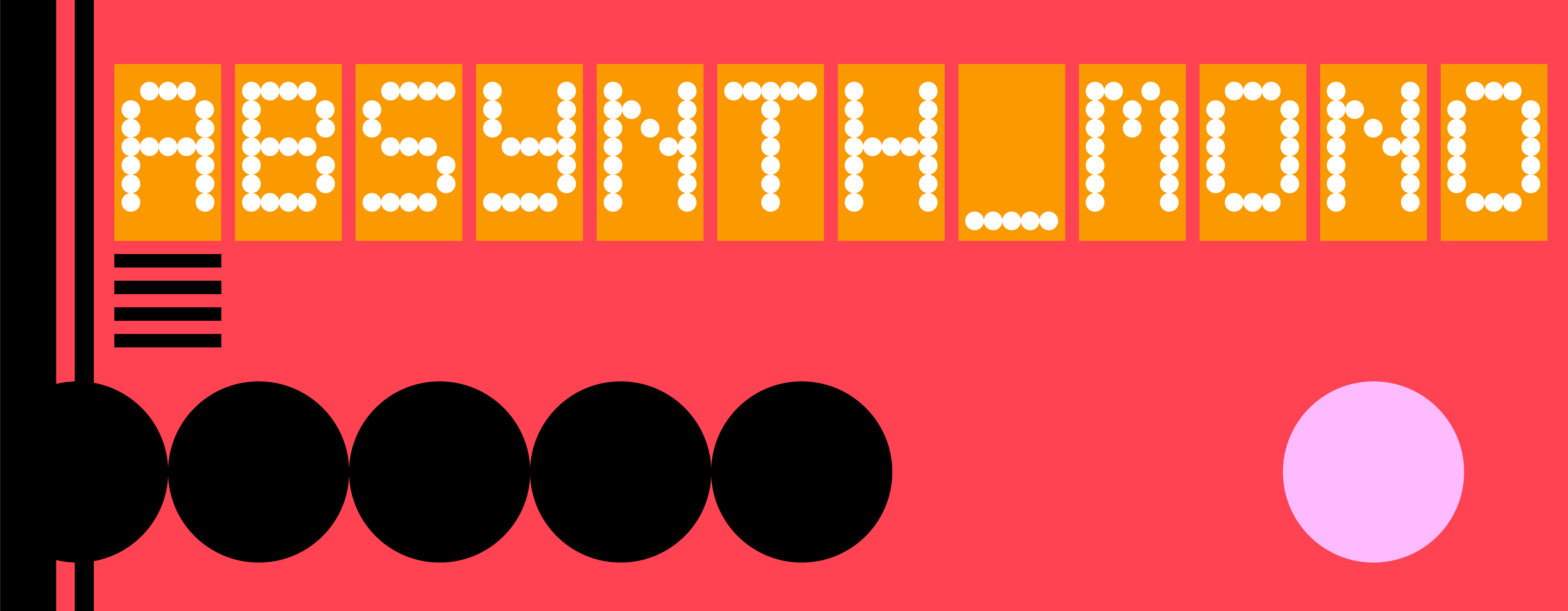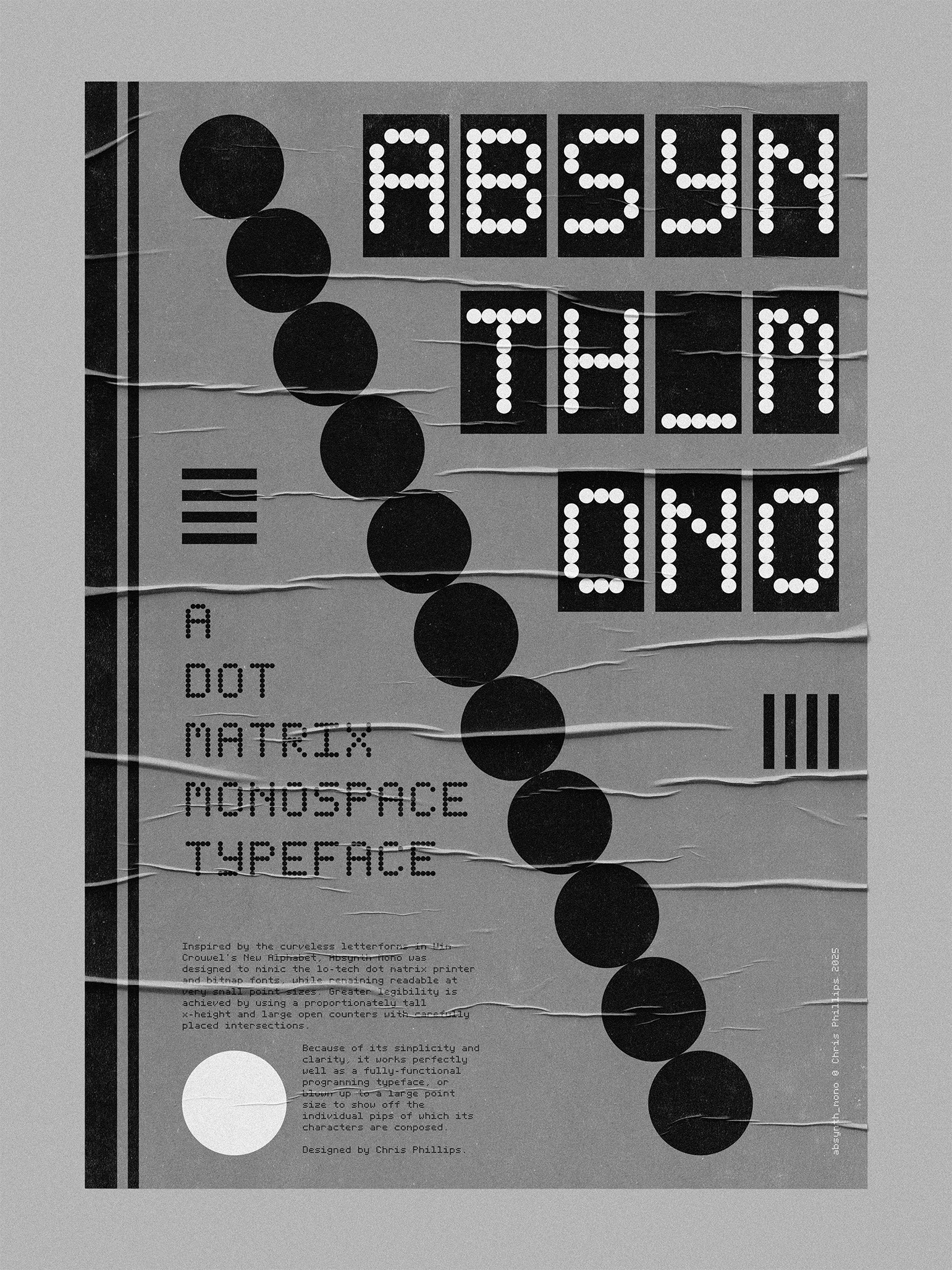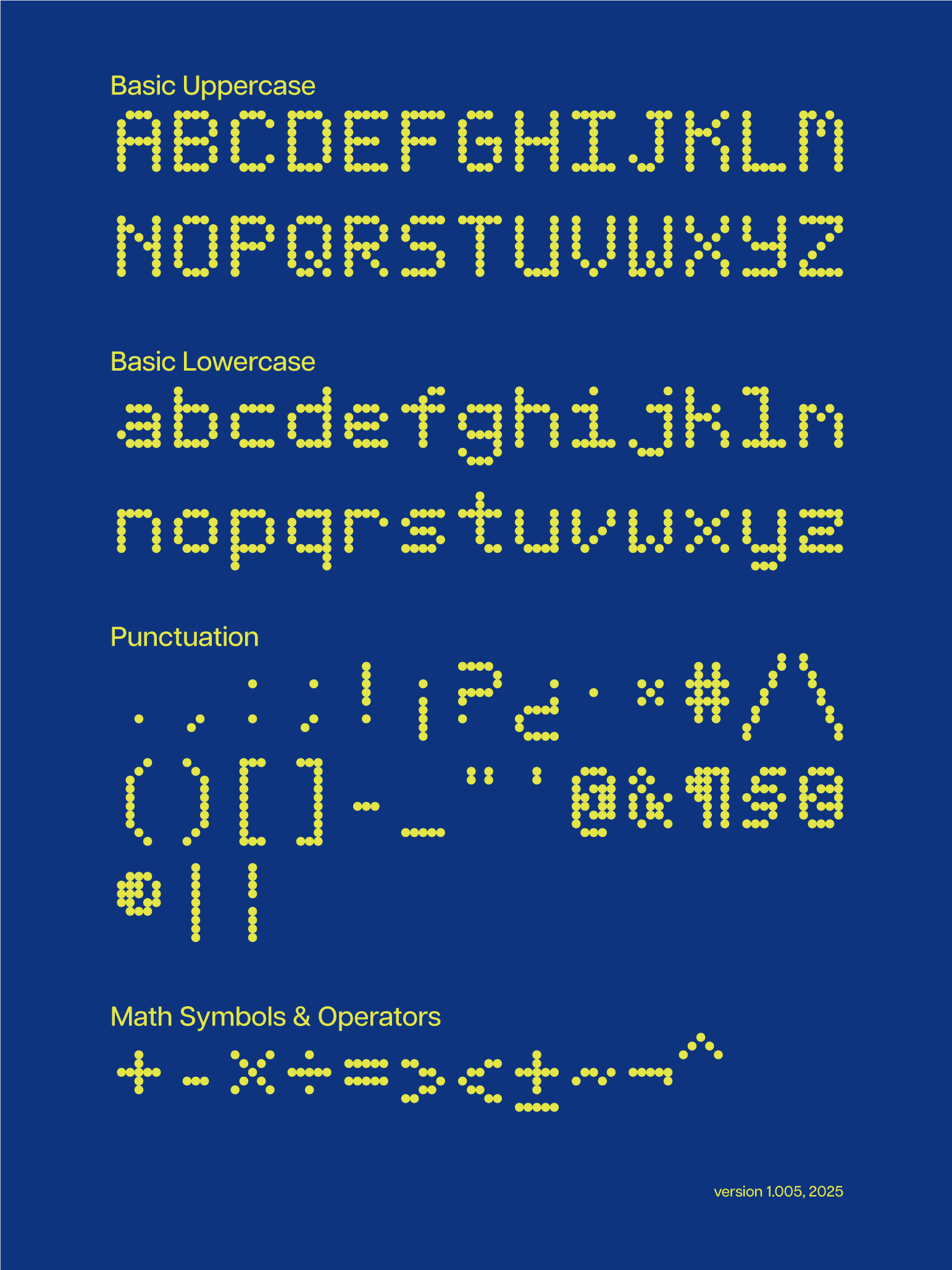


Absynth Mono was designed to mimic the lo-tech dot matrix printer and bitmap fonts, while remaining readable at very small point sizes. Greater legibility is achieved by using a proportionately tall x-height and large open counters with carefully placed intersections.
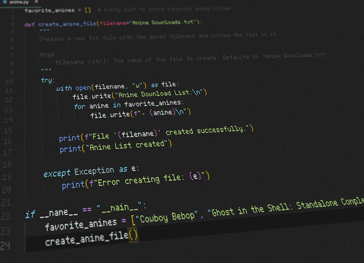
Because of its simplicity and clarity, it works perfectly well as a fully-functional programming typeface, or blown up to a large point size to show off the individual pips of which its characters are composed.
